Best way to add impact

RolyT

Apprentice elf
Generous elf
Joined
Oct 8, 2021
Messages
61
Started 2 years ago just by adding 500 pixels to my standard Bunnings lights and inflatables. They were just installed on PVC in 2 horizontal runs with one along the second floor gutter line and one along the first floor gutter line. I have just been using WLED and using them as fairy lights with basic colour changing and some chases etc which was pretty good but now want to increase the number of lights and use some different effects.

I was thinking of adding some verticals to the house outline and adding 4-5 arches and some peace stakes. However, most of the cool effects I see seem to look best on "non-linear" props eg megatrees, matrices etc or across whole house with lots of lights.

Is there any point looking into the xlights effects like balls, windmill etc if all my pixels are going to be in single linear runs?

Should I be looking at adding a small matrix or even mini matrices on the entrance columns to add more width for effects?

Or multiple other props (stars/spinners/etc) across the house and yard? Only looking to get to around 3000 pixels but struggling to figure out how to use these extra for most impact.

Megatree is not an option..

Appreciate any advice
 
Paging @mshort - Matt started last year with just house outlines and gave a really good presentation at the Sydney mini about how he approached the various challenges he encountered.

Verticals were something I added last-minute with my display on the first year, and I am so glad I did, they gave the display a certain pop element, the height played in nicely.
Arches are always fun, you can do some neat effects there. Mini-trees and/or spiral trees can be used in quite creative ways too.

Everything you add will give impact. You now have individually controlled million colour lights, compared to just blinking strings.
And you will be wow-ing your audience with whatever you do. Work up to it as well - switch and change it each year - see what you like and what you dont. Pulling and pushing pixels is a pain but you do have that flexibility.
 
I'll agree with @Skymaster in that a proper house outline of horizontals and verticals can make a huge difference and while linear have a low pixel count but are used nicely in most sequences. To maximize your pixels looks for medium density props. Medium Spinners, multilayered arches, Spirals trees with small stars. My preference is to put things in multiples of 2,4,6,8. A lot of sequences make good use of 8 props. Now you don't need 8 exact props but similar helps, 8 different flakes, stars, ornaments etc.

My first show was 4 arches, 2 spiral trees, 2 small spinners, 2 small flakes, 2 medium flakes, 2 medium spinners, and a small wreath wreath and some 5 pixel and 13 pixel peace stakes. I only did the lower level of my house on my front lawn where I tried to setup things for some depth variation.

A matrix will take a lot of attention and with a small show it could possibly overwhelm the other props, just my opinion.

At the end of the day, it is really all about YOU, what YOU like and what YOU think will work.
 
Agree with @Skymaster and @Indigogyre.

One thing to consider... I don't yet have house outlines because my house is non-conventional. Almost every single sequence in existence has house outlines and if you're inclined to mostly take pre-packaged sequences mapping/reworking the effects from the outlines to something else in your display every single time is really painful.

This year I am really wanting to add outlines.
 
Yeah this is one of my issues also as have a weird structure to outline and I've been banned from doing the roof by the missus..

I hadn't even thought about buying sequences as I figured they'd mostly be for massive displays and not worth it on a much smaller display with fewer props etc
 
Last year my show was just outlines! Yes, it can be hard to make something look good but if you play around you can have something that looks pretty decent. Although outlines are linear, when you group them up and put an effect on the group it can look good. I found that most sequences have an ALL_HOUSE group, OUTLINES group and possibly WINDOWS group, mapping these is a great starting point and sometimes will get you most of the way there.

You can check out some of my sequences here which may give you some ideas: https://auschristmaslighting.com/videos/users/mshort.37124/
 
Yeah this is one of my issues also as have a weird structure to outline and I've been banned from doing the roof by the missus..

I hadn't even thought about buying sequences as I figured they'd mostly be for massive displays and not worth it on a much smaller display with fewer props etc
I technically do not do my roof lines. I have a single horizontal below the roof line on my second floor, one below the porch roof line, and across my garage above the door. It's amazing how much even a little bit of outline made my show more dynamic. If you want to be flooded with additional design ideas post a picture of your house and many comments will come in about how different people might work with it.

Creative think helps when looking at things.
A window is not just a windows, it is also 2 verticals and 2 horizontals, it just depends on how it is used during a sequence.
A Snowflake is a flake, but also a spinner, a flood.

Since it's not yet been mentioned use this sequence search engine site. It will help you find free sequences to start.

I've never once made my own sequence and have used someone else's for the last 3 years. I started with a bunch of the free ones, bought some the second year and bought more the 3rd year. From the second year on when I bought sequences I always went with the pro version as I planned to keep expanding into using the full thing. Otherwise I would just map a big show to my smaller show. A lot of vendors offer free sample sequences also that are nice to start with. Browse all the vendors looking for the free sequences. This will also give you more ideas of layouts and which props you might like to use.

I'll be going on my 4th year and each year my show has evolved to where I want it to be. It's taking time but I'm finding what I like and dislike and making changes as I go. My space is limited and I "feel" like I will be hitting the pixel saturation limit soon. There are a few more things I would like to do but that's only adding in HD matrix and props.

I've had some very good luck with people from this board that were able to help me along my journey.

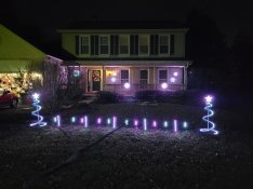
First Year:
FirstYear.jpg

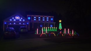
Third Year:
ThirdYear.jpg

In the end, it's a hobby that we should be enjoying. :)
 
Back
Top