Typical spacing of pixel lights

layzer1

New elf
Joined
Jan 2, 2020
Messages
43
Is there a standard or guideline for what kind of spacing should be used between pixels? For example if I'm doing a trim on the roof/garage door/windows, should I use a 3 inch spacing or 2 inch spacing? Here is a sketch of what I had in mind for this year to get the hang of it.
xLights House layout.PNG
 
Last edited:
It really depends. My window outlines are 6 inch but my rooflines are 1.25 inch. Very different but both look great. The 6 inch spacing bulbs are large while the house outline is just naked 5050 leds so you need more density. Bullets looks best as 2-3 inches.
 
no real standard, it's all personal preference, and depends on a lot of things, for example how dense you want it to look and how far your audience will be viewing it from
 
Yeah, the length of run will determine the number of pixels and potentially power injection requirements. I run 2" on window outlines, and 3" on my garden outlines & house perimeter outlines. My house is about 6 metres from the road and it looks fairly dense.

For long runs (in my case, that spend the left to right of my house) I feel 3 inch is ok as you have the distance to run good effects over the pixels, where as for window outlines you have less distance to work with (making gradients, fades, etc look less effective with fewer pixels).

If you look in the display videos library here on ACL here, I have uploaded a few videos of my display that show different types of effects on the 2" vs 3" spacing.


Dan
 
I will be custom making my props on the house and I will use a 60mm spacing. For objects closer to the road I use 50mm
 
Best way is to test. As others have mentioned viewing distance is the biggest determining factor on pixel spacing. I use C9's with 5" spacing because most viewers are 100+ feet from the house. The closer you are to the street/viewers the closer you would want the spacing. In my opinion 3" spacing would be more than adequate for most displays
 
I used 50mm Spacing on everything so that I could maintain definitive effects over whole house and yard elements. My viewing distance is from 15 meters to 20 meters there abouts and to me looks Ok.

The 50mm choice was mainly due to matching the 2inch spacing on my mega tree mounting strips that I had and now with all the new products coming out like chroma trim the 50mm/2inch spacing is a good choice if you want uniformity and plan on buying pixel node mounting products instead of drilling a million holes like I did.

I would still love to reduce the spacing, say 25mm but it would simply not be economical. The closer you can get them obviously offers better definition and allows you to achieve any look you want. If you want a wide spaced effect you can simply group it that way.
 
My street is somewhat narrow so viewing would be 15meters, if that. So maybe going 3inch spacing might not be ideal?
 
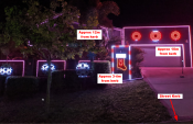
For what it's worth here is a photo of mine with some approximate distances from the street. My street is also narrow with car street parking only on one side, otherwise, cars on both sides would block the traffic.
I used 50mm spacing on all straight runs. Prop spacing averaged from 40-55mm spacings.
I'm happy with 50mm, even though you can clearly see each node in the photo. But, while you are enjoying a show you don't even notice it. I was planning on 25mm spacing on the fence line, and I'm glad I didn't as it would have been overkill.
lights.png
 
For what it's worth here is a photo of mine with some approximate distances from the street. My street is also narrow with car street parking only on one side, otherwise, cars on both sides would block the traffic.
I used 50mm spacing on all straight runs. Prop spacing averaged from 40-55mm spacings.
I'm happy with 50mm, even though you can clearly see each node in the photo. But, while you are enjoying a show you don't even notice it. I was planning on 25mm spacing on the fence line, and I'm glad I didn't as it would have been overkill.
View attachment 14190
This is awesome Chad. Makes me want to reconsider doing 2inch vs 3 inch cause it looks cleaner but that would add a substantial amount of pixels and power considering I've never done this before and require $$. I'll see how this year goes and kind of go from there. It will give me time to save more $$ lol
 
Nothing stopping you from doing 3in this year and when funds build, upgrade next year to 2in
 
One thing you can also do is look at how you will be setting up your elements or props. If you look at using your nodes on a white background or using them end to end, you will notice that the gaping is visually reduced due to the reflection on a white background and the diffusion through a bullet node if you use them end to end. 50mm is also pretty much perfect for end to end as well.
 
I'll be doing roof lines this year, but since my house is around 100m from the road, I'll be going with 90mm spacing.

Why 90mm not 100mm ? ... default supply of pixels has 100mm spacing, and 90mm is about the most 'stretch' I can get out of it. Sure, I could order different pixel spacing, but I think the extra effort isn't going to give me much more.
 
This thread is very old. An answer might not be needed anymore.
Back
Top